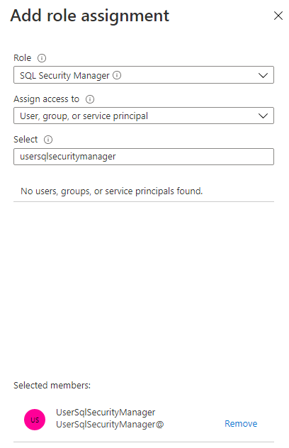
- In our example, we’ll assign the SQL Security Manager role to the user
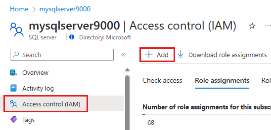
UserSqlSecurityManager@contoso.onmicrosoft.com. Using privileged user that can assign Microsoft Entra roles, sign into the Azure portal. - Go to your SQL server resource, and select Access control (IAM) in the menu. Select the Add button and then Add role assignment in the drop-down menu.

- In the Add role assignment pane, select the Role SQL Security Manager, and select the user that you want to have the ability to enable or disable Microsoft Entra-only authentication.

- Click Save
Enable Microsoft Entra-only authentication;
Enable in SQL Database using Azure portal
To enable Microsoft Entra-only authentication in the Azure portal, follow these steps:
- Using the user with the SQL Security Manager role, go to the Azure portal.
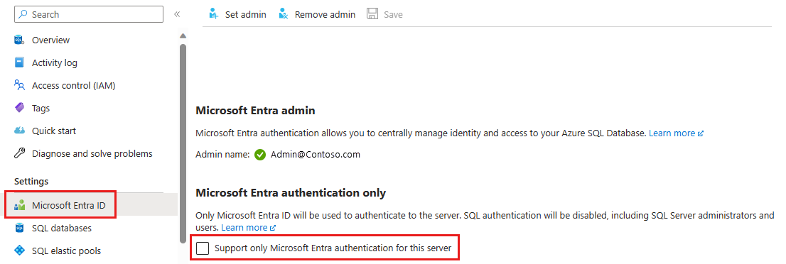
- Go to your SQL server resource, and select Microsoft Entra ID under the Settings menu.

- If you haven’t added an Microsoft Entra admin, you’ll need to set this before you can enable Microsoft Entra-only authentication.
- Check the box for Support only Microsoft Entra authentication for this server.
- The Enable Microsoft Entra-only authentication popup will show. Select Yes to enable the feature and Save the setting.
Enable in SQL Managed Instance using Azure portal
To enable Microsoft Entra-only authentication in the Azure portal, see the steps below.
- Using the user with the SQL Security Manager role, go to the Azure portal.
- Go to your SQL managed instance resource, and select Microsoft Entra admin under the Settings menu.
- If you haven’t added an Microsoft Entra admin, you’ll need to set this before you can enable Microsoft Entra-only authentication.
- Select the Support only Microsoft Entra authentication for this managed instance checkbox.
- The Enable Microsoft Entra-only authentication popup will show. Select Yes to enable the feature and Save the setting.
Reference
