2 column layouts are rather popular on the web, and there are 1,001 ways to make them work. The approach you choose really depends on the type of content you have, and how you want images and backgrounds to work. What I’ll show is the Razor _Layout and CSS to achieve the following look:
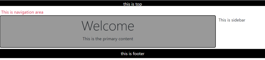
The Razor _Layout file can rely on partial views to handle each of the primary sections: top, navigation, sidebar, and footer. RenderBody will produce the primary content area.
<!DOCTYPE html>
<html>
<head>
    <title>@ViewBag.Title</title>
    <link href="@Url.Content("~/Content/Site.css")"
          rel="stylesheet" type="text/css" />
</head>

<body>
    @Html.Partial("_top")
    @Html.Partial("_navigation")
    @Html.Partial("_sidebar")
    <div id="body">
        @RenderBody()
    </div>
    @Html.Partial("_footer")
</body>
</html>
A quick note on Html.Partial. If any sections, like the sidebar and navigation sections, require some logic or model information to build their piece of the UI, then use Html.Action instead of Html.Partial. Html.Action allows you to setup a little sub-request inside the current request and allow a controller action to build a model and select a view.
The CSS coming up assumes each partial view will render inside an element with an id matching it’s purpose (so the _top view renders a div with an id of top).
<div id="top">
    This is the top content
</div>
Then finally, add some styles to the CSS file:
#top {
    height: 20px;
    text-align: center;
    background-color: black;
    color: white;
}

#navigation {
    height: 25px;
    margin: 5px;
    padding: 5px;
    color:crimson;
}

#sidebar {
    margin: 5px;
    padding: 5px;
    position: absolute;
    top: 50px;
    left: 314px;
}

#body {
    width: 300px;
    padding: 5px;
    margin: 5px;
    background-color: #999999;
    border-radius: 5px;
    border: 2px black solid;
}

#footer {
    padding: 5px;
    text-align: center;
    background-color: black;
    color: white;
}
The trick is to use absolute positioning on the sidebar content, which is possible because we know the exact amount of space taken by the 2 sections at the top of the page, and we know the exact width of the content area (it is set explicitly in the CSS). You’ll probably want to give the body more space than the 300px given in the sample above (which was constrained so the screenshot would fit on this page).
Resources
https://dev.to/codeply/bootstrap-5-sidebar-examples-38pb

 Add to favorites